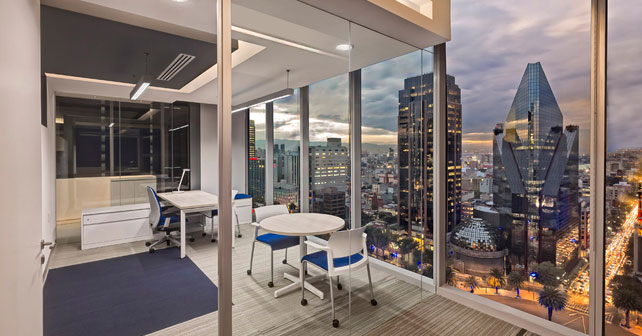
Corporativo Capital Reforma (Ciudad de México) por usoarquitectura. Consolidar a dos empresas -que ahora son una sola- en un mismo espacio y marcar los lineamientos de cómo debe ser de la empresa en todo el mundo no es una tarea fácil. Por lo que atender la solicitud del cliente y darle forma a su identidad fue una oportunidad que no desaprovechamos. ¿Cómo lo hicimos? Incorporando en pisos, muros y plafones algunos detalles o referencias que podemos encontrar cuando abordamos un avión.
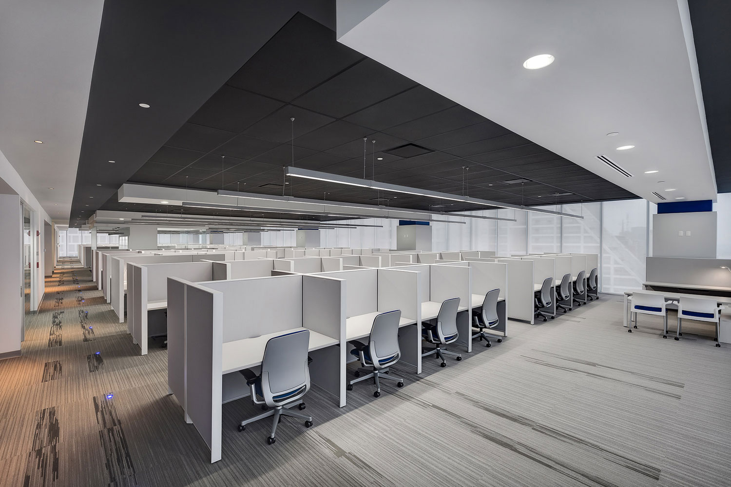
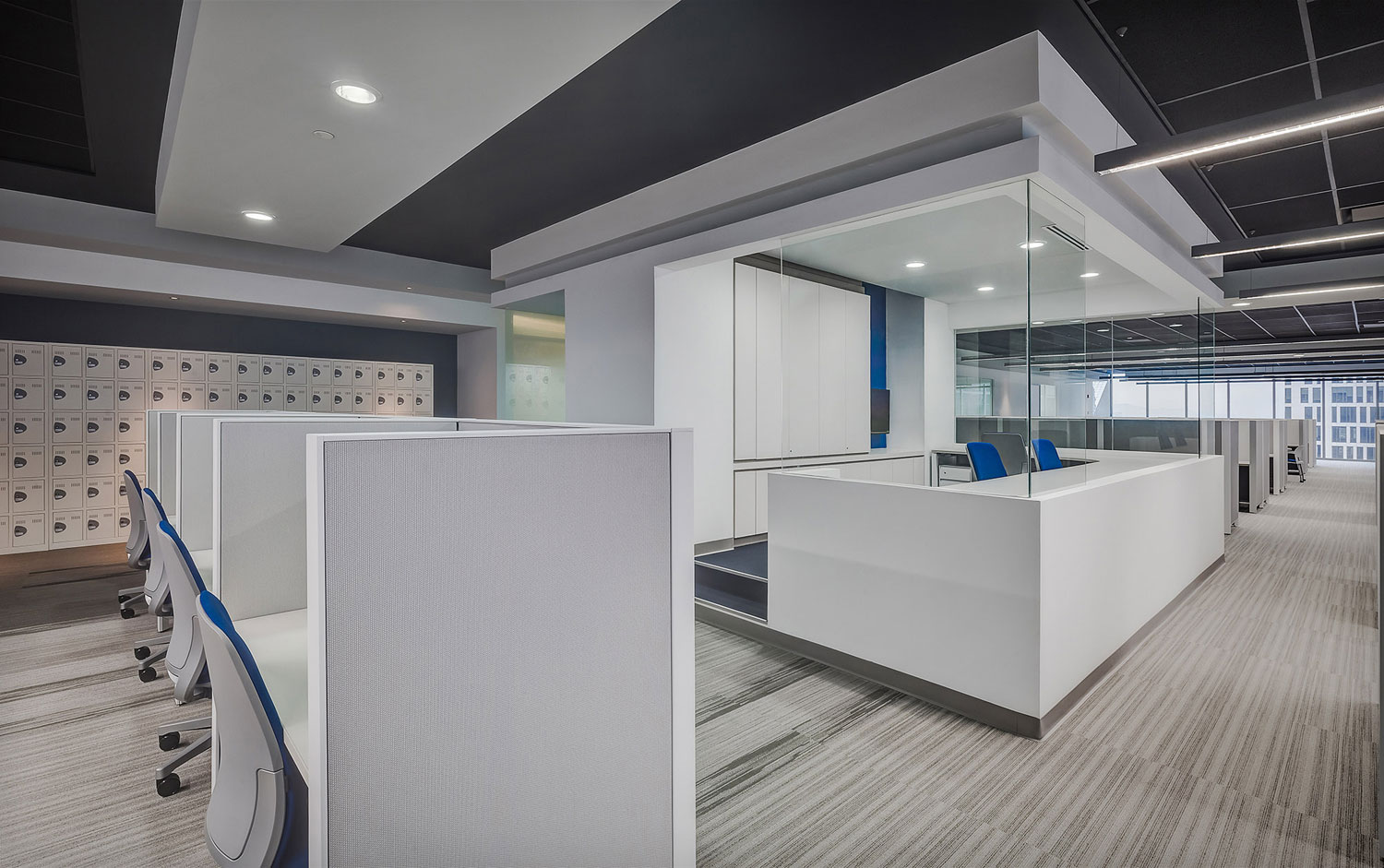
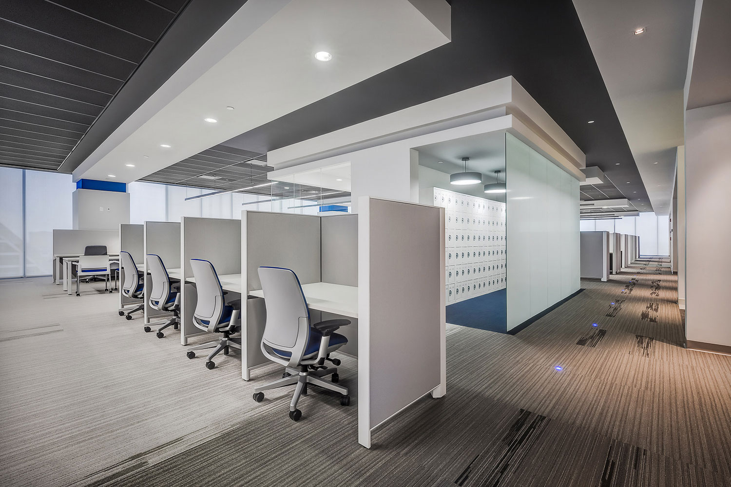
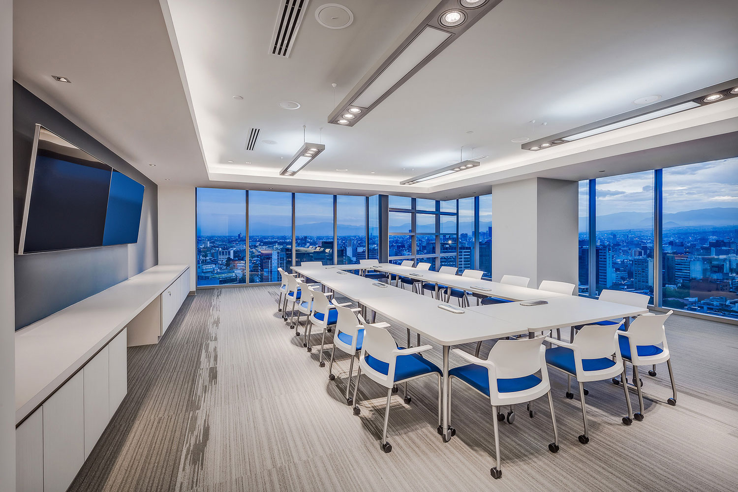
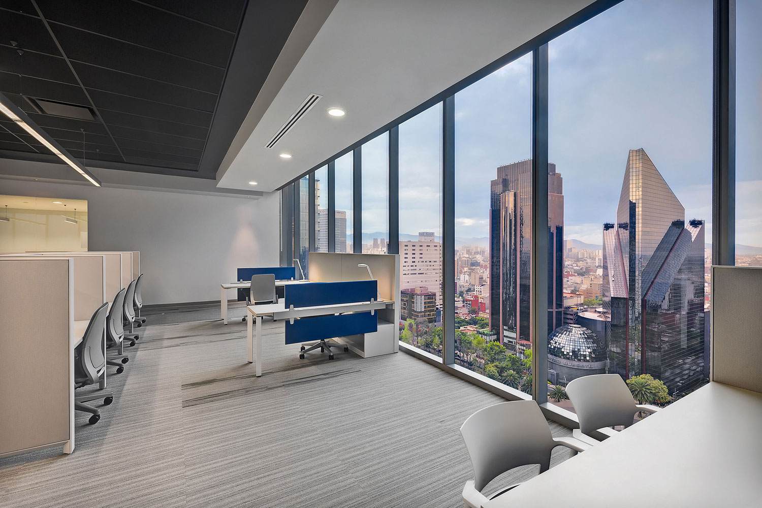
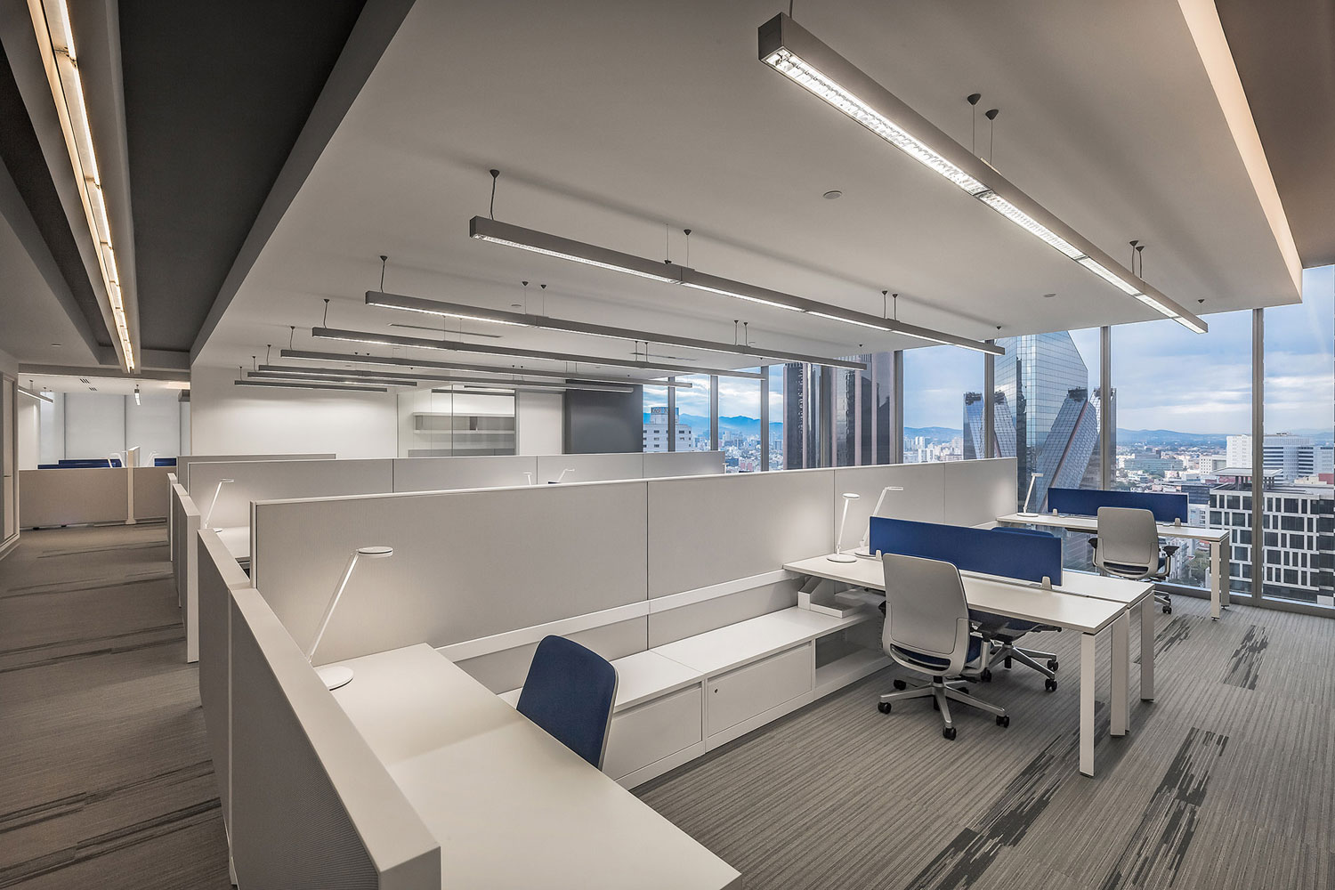
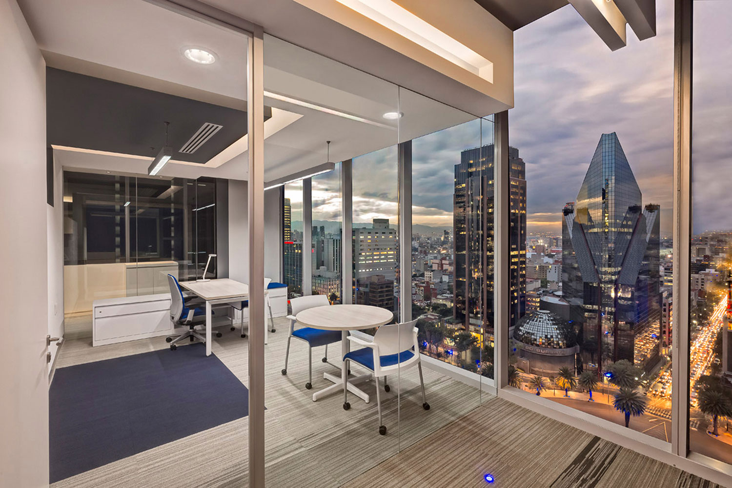
Es responsabilidad del arquitecto identificar cuando se trata de un proyecto que debe ser mesurado y sin un alarde exagerado de diseño, pero esto no es pretexto para descuidarlo. La paleta de color incluye 12 tonalidades de gris claro, acompañadas de tres tonalidades de gris obscuro, azul y negro para contrastar.
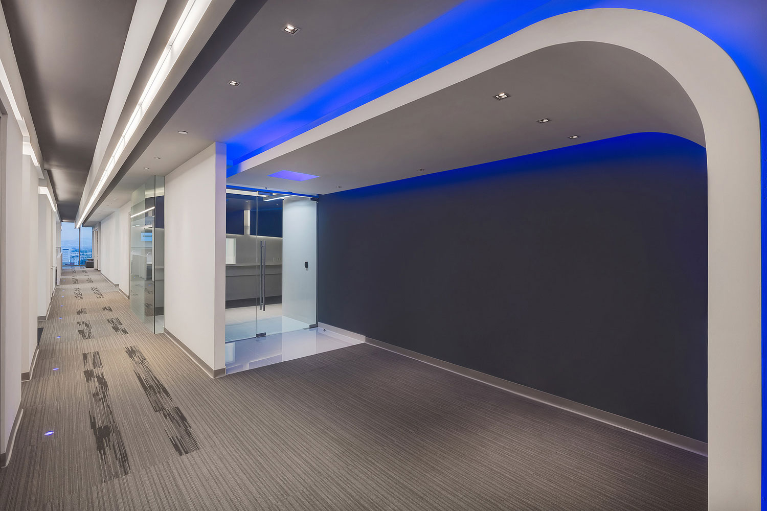
Se eligió mobiliario en color blanco para destacar la paleta de color y los diferentes modelos de alfombra que en su diseño muestran unas líneas parecidas a la huella que dejan los neumáticos de los aviones al aterrizar y para reforzar esta referencia se colocaron luminarias led en el piso replicando a las que delimitan las pistas de aterrizaje.
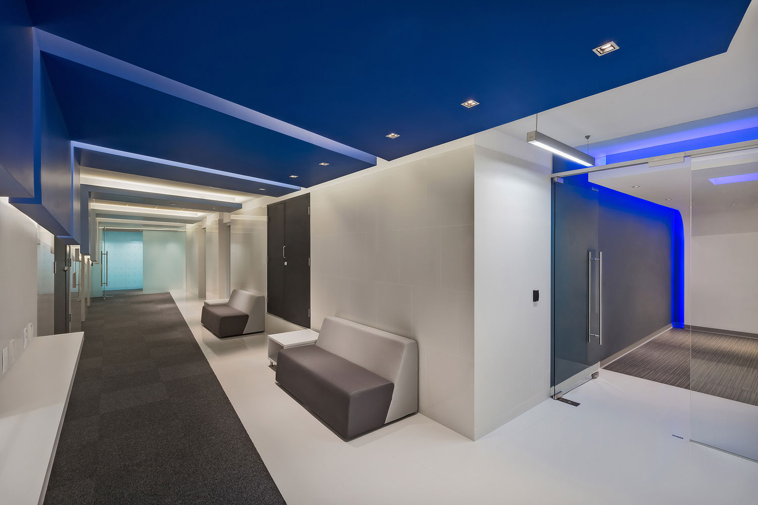
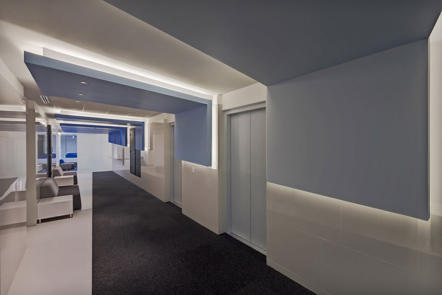
En el caso del vestíbulo de elevadores se eligió una alfombra guardapolvo en color negro colocada intencionalmente en diagonal para simular el ala de un avión, las líneas diagonales también pueden encontrarse en los plafones y el mobiliario de espera.
Cuando iniciamos el proyecto nos mostraron fotografías de cómo eran las oficinas en otras locaciones. Hoy nos sentimos orgullosos de que nuestro proyecto es el referente para las nuevas oficinas de la aerolínea en Londres, Japón y otras partes del mundo.
Ficha técnica
Nombre: Corporativo Capital Reforma
Ubicación: Ciudad de México
Proyecto: usoarquitectura (Gabriel Salazar y Fernando Castañón)
Colaboradores: Gerardo Gavito
Constructora: GIA
Mobiliario: Steelcase
Construidos: 1700 m2
Año: 2014
Fotografía: Héctor Armando Herrera
Contacto
http://www.usoarquitectura.com.mx
English version
Consolidate two companies -that finally became one- in the same space and set the standards of how the company’s offices must be around the world is not an easy task. This is why attending the customer’s request and shaping their identity was an opportunity not to be wasted. How we did it? Incorporating in floors, walls and ceilings some details or references that we may find when we board a plane.
It is the responsibility of the architect to identify when it is a project that must be restrained and designed without an exaggerated show, but this is no excuse for neglecting it. The color palette includes 12 shades of light gray, accompanied by three shades of dark gray, blue and black for contrast.
The furniture was chosen in white to standout in the color palette. The different models of carpet show in their design patterns similar to the footprint left by the aircraft tires when landing and to reinforce this reference led lights were placed on the floor replicating the ones that delimit the airstrips.
In the elevators lobby a black dust cover carpet was intentionally placed diagonally to simulate the wing of an airplane, the diagonal lines are also found in the ceilings and furniture in the waiting room.
When we started the project we showed pictures of how the offices were in other locations. Today we feel proud that our project is the benchmark for the new offices of the airline in London, Japan and other cities of the world.